Polarity Classification
Polarity classification is a fundamental aspect of sentiment analysis to measure the overall emotional tone expressed in text data which can be categorized as positive, neutral or negative.
Most models assign “sentiment scores” with values ranging from -1 to +1 to represent the intensity of the sentiment, being scores closer to -1 considered negative, those closer to 0 neutral and +1 positive.

We will be using the package sentimentr (more info) to compute polarity classification and attribute sentiment scores to the posts included in our dataset.
Traditional sentiment analysis techniques assign polarity by matching words against dictionaries labeled as “positive,” “negative,” or “neutral.” While straightforward, this approach is overly simplistic: it ignores context and flattens the richness of our syntactically complex, lexically nuanced language, that transcends individual words. The sentimentr package extends lexicon-based methods by accounting for valence shifters; words that subtly alter sentiment.
The package includes 130 valence shifters that can reverse or modulate the sentiment indicated by standard dictionaries. These fall into four main categories: negators (e.g., not, can’t), amplifiers (e.g., very, really, absolutely, totally, certainly), de-amplifiers or down-toners (e.g., barely, hardly, rarely, almost), and adversative conjunctions (e.g., although, however, but, yet, that being said). This refinement is important because simple dictionary lookups miss the nuanced meaning.
In summary, each word in a sentence is checked against a dictionary of positive and negative words, like the Jockers dictionary in the lexicon package. Words that are positive get a +1, and words that are negative get a -1, which are called polarized words. Around each polarized word, we look at the nearby words (usually four before and two after) to see if they change the strength or direction of the sentiment. This group of words is called a polarized context cluster. Words in the cluster can be neutral, negators (like “not”), amplifiers (like “very”), or de-amplifiers (like “slightly”). Neutral words don’t affect the sentiment but still count toward the total word count.
The main polarized word’s sentiment is then adjusted by the surrounding words. Amplifiers make it stronger, de-amplifiers make it weaker, and negators can flip the sentiment. Multiple negators can cancel each other out, like “not unhappy” turning positive.
Words like “but,” “however,” and “although” also influence the sentiment. Words before these are weighted less, and words after them are weighted more because they signal a shift in meaning. Finally, all the adjusted scores are combined and scaled by the sentence length to give a final sentiment score for the sentence.
With this approach, we can explore more confidently whether the show’s viewers felt positive, neutral, or negative about it.
Computing Polarity with Sentiment R (Valence Sifters Capability)
Calculating sentiment scores
Here we’re using the sentiment_by() function which looks at each comment and calculates a sentiment score representing how positive or negative comments are. Let’s enter the following code to select all the values contained in the comments column:
sentiment_scores <- sentiment_by(comments$comments)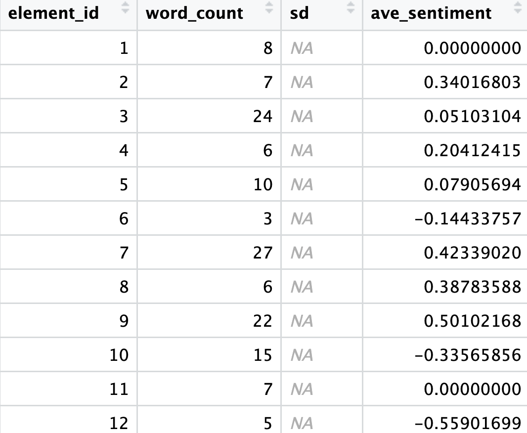
So after running this, we get a new object called sentiment_scores with the average sentiment for every comment. Can you guess why the SD column is empty? A single data point (sentence/row) does not have a standard deviation by itself.
Adding those scores back to our dataset
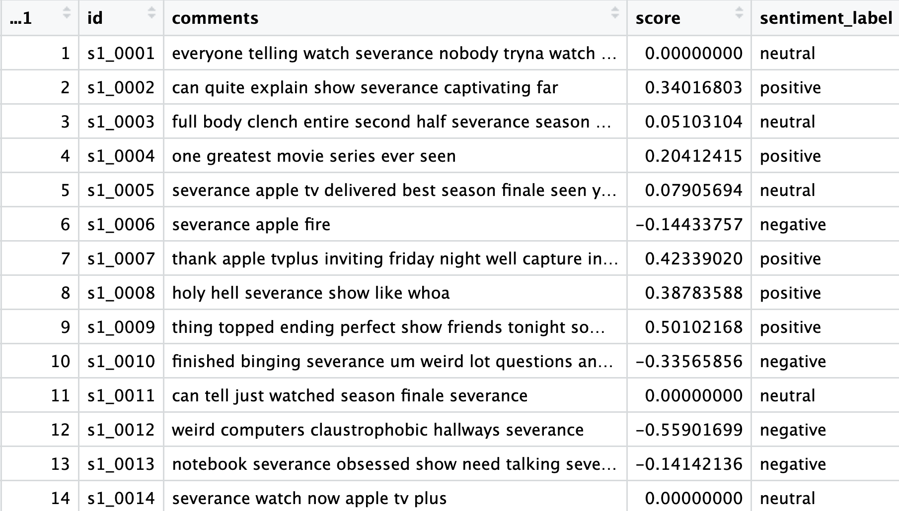
Now we’re using the dplyr package to make our dataset more informative. We take our comments dataset, and with mutate(), we add two new columns: score and sentiment label. The little rule inside case_when() decides what label to give. The small buffer around zero (±0.1) helps us avoid overreacting to tiny fluctuations.
polarity <- comments %>%
  mutate(score = sentiment_scores$ave_sentiment,
         sentiment_label = case_when(
           score > 0.1  ~ "positive",
           score < -0.1 ~ "negative",
           TRUE         ~ "neutral"
         ))
Let’s now take a look at the sentiment_scores data frame:
To get a sense of the overall “mood” of our dataset let’s run:
table(polarity$sentiment_label)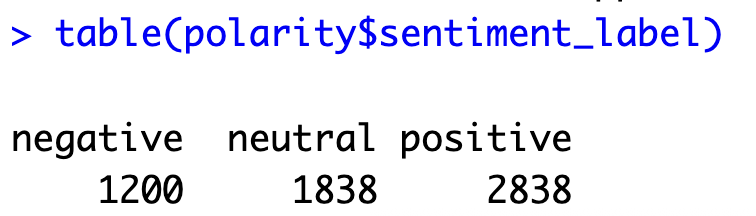
Overall, the majority of viewers reacted positively to the show, with positive opinions more than double the negative ones, indicating a generally favorable reception. However, this is only part of the story—positive sentiment can range from mildly favorable to very enthusiastic. To better visualize the full distribution of opinions, a histogram is presented below.
Plotting Scores
Next, let’s plot some results and histograms to check the distribution for the scores:
# Visualize
ggplot(polarity, aes(x = score)) +
  geom_histogram(binwidth = 0.1, fill = "skyblue", color = "white") +
  theme_minimal() +
  labs(title = "Sentiment Score Distribution", x = "Average Sentiment", y = "Count")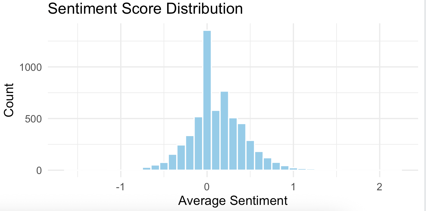
This histogram suggests that the overall sentiment toward the Severance show was mostly neutral to slightly positive. This suggests that most viewers are expressing their opinions without using intense emotional language (either extremely positive or negative).
We can also break the data down by season to compare how audience opinions vary over each season finale:
# Extract season info (s1, s2) into a new column
polarity_seasons <- mutate(polarity,
                           season = str_extract(id, "s\\d+"))

# Histogram comparison by season, using Density
ggplot(polarity_seasons, aes(x = score, fill = season)) +
  geom_histogram(aes(y = after_stat(density)),
                 binwidth = 0.1,
                 position = "dodge",
                 color = "white") +
  theme_minimal() +
  labs(title = "Sentiment Score Distribution by Season (Normalized)",
       x = "Average Sentiment Score (Polarity)",
       y = "Density (Proportion of Comments)") +
  scale_fill_brewer(palette = "Set1")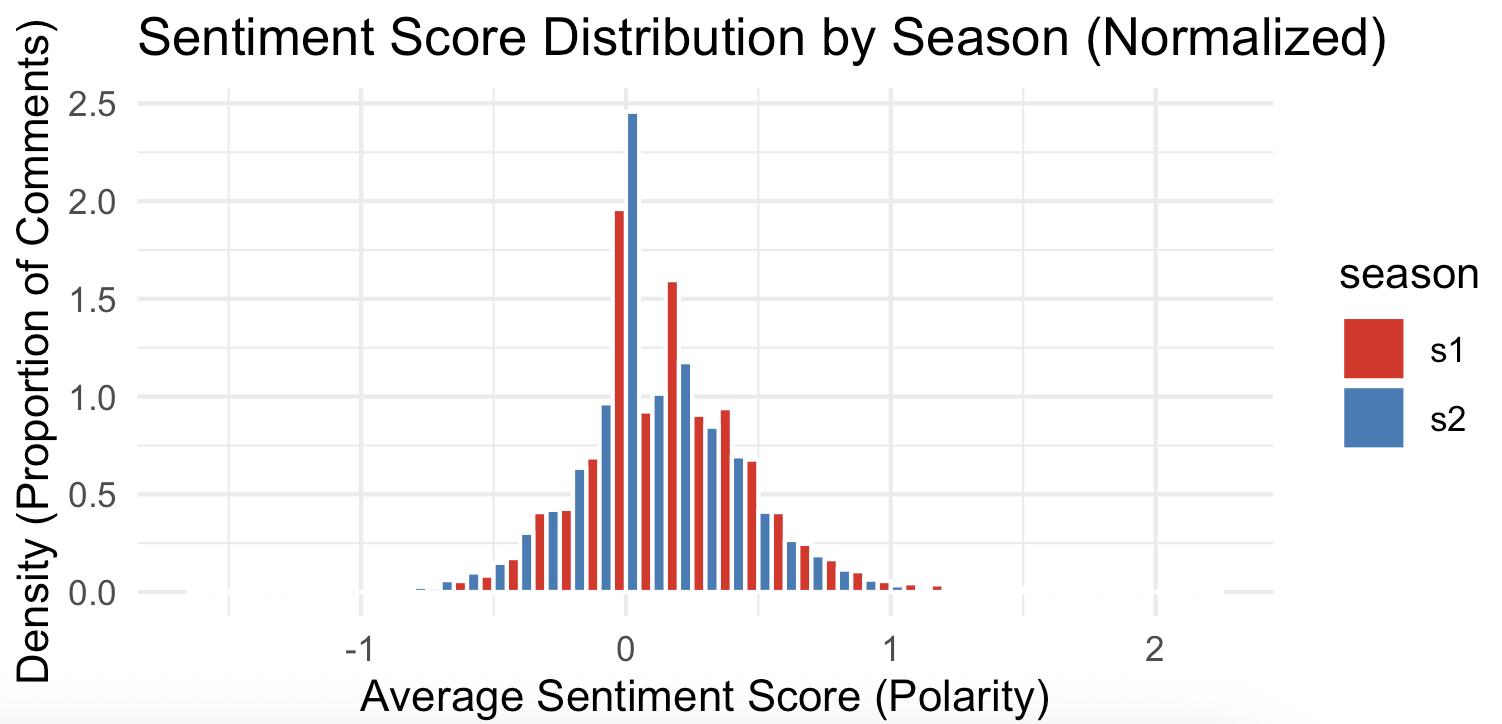
This plotting approach usind density allows us to directly compare the heights of the bars to determine which season had a higher proportion of comments at a specific polarity score, regardless of the total number of comments for that season.
This result let us infer that there were differences in audience reception and reaction between the two season finales. Overall, the S1 finale resulted in a strongly positive audience reaction, while the S2 finale led to a more mixed, analytical, and critical conversation, with significantly more proportional negative sentiment than S1.
Saving Things
# Save results
dir.create("output", recursive = TRUE, showWarnings = FALSE) #create dir
write_csv(polarity, "output/polarity_results.csv")
We could have spent more time refining these plots, but this is sufficient for our initial exploration. In pairs, review the plots and discuss what they reveal about viewers’ perceptions of the Severance show.
Well, that’s only part of the story. Now we move on to emotion detection to discover what else we can learn from the data.